Nige was a legend when it came to the whole branding for Shutter Circle. As a team we sat down with Nige and talked over our ideas and goals and he really listened and came up with the whole concept, brand, colour schemes and even produced a whole detailed brand guidelines so we could refer back to this for our tone of voice and to remind us of the way to present ourselves across multiple platforms.
Nik Bryant, Founder, Shutter Circle
About The Brand
Shutter Circle is a UK-based collective of wedding photographers helping fellow creatives connect, grow and thrive. The platform links photographers and videographers with second shooter and shadowing opportunities, alongside straight-talking content that supports both creative skills and business growth.
It’s a friendly, ego-free space for camera creatives — built by people who know the industry inside out and understand that good photography is as much about relationships as it is about the lens.
The Challenge
Still in its early days, Shutter Circle needed a full brand identity that matched its purpose: modern, community-first and built on trust. The look and feel had to be warm and approachable, while confident enough to stand out on social media feeds, industry forums and at live events.
They wanted to sidestep the stiff, corporate aesthetic so common in creative networks — instead aiming for something inclusive, encouraging and forward-thinking, with a clear visual language that felt genuinely inviting.
The Approach
We began with a Zoom call to set the brief, followed by a straightforward questionnaire to capture early ideas. That led to an in-person discovery workshop — relaxed but productive, fuelled by conversation, exercises and strong coffee.
Once we’d mapped out the brand values, tone and personality, I moved into sketching and concept development. With the visual direction taking shape, I brought in copywriter Dan Lever to help sharpen the brand voice. Together we carried out competitor analysis and created messaging that felt clear, warm and quietly confident.
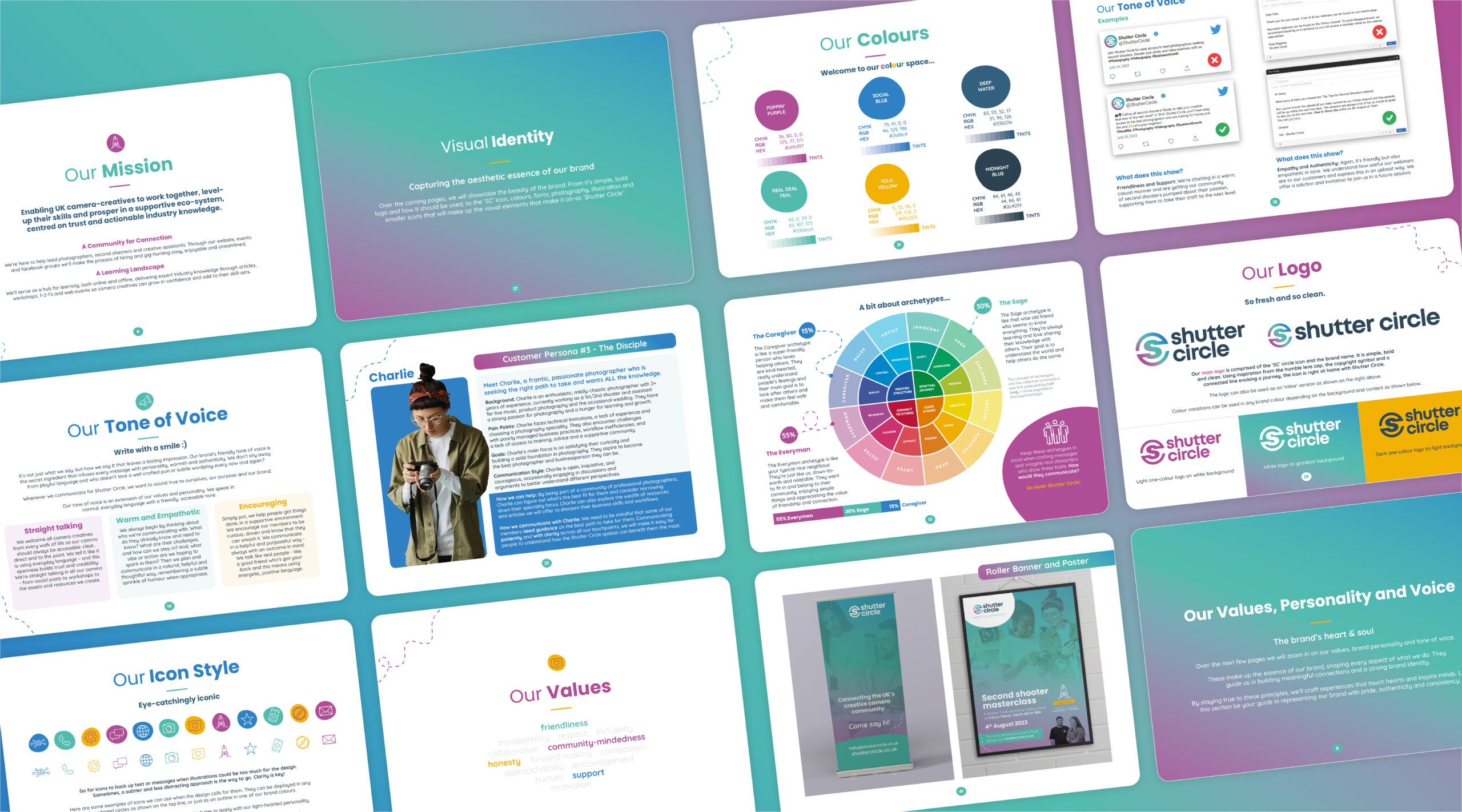
We also explored brand archetypes, combining three — the Everyman, the Sage and the Caregiver — to guide both the creative direction and the community ethos. That foundation informed every design and copy decision that followed.
The Solution
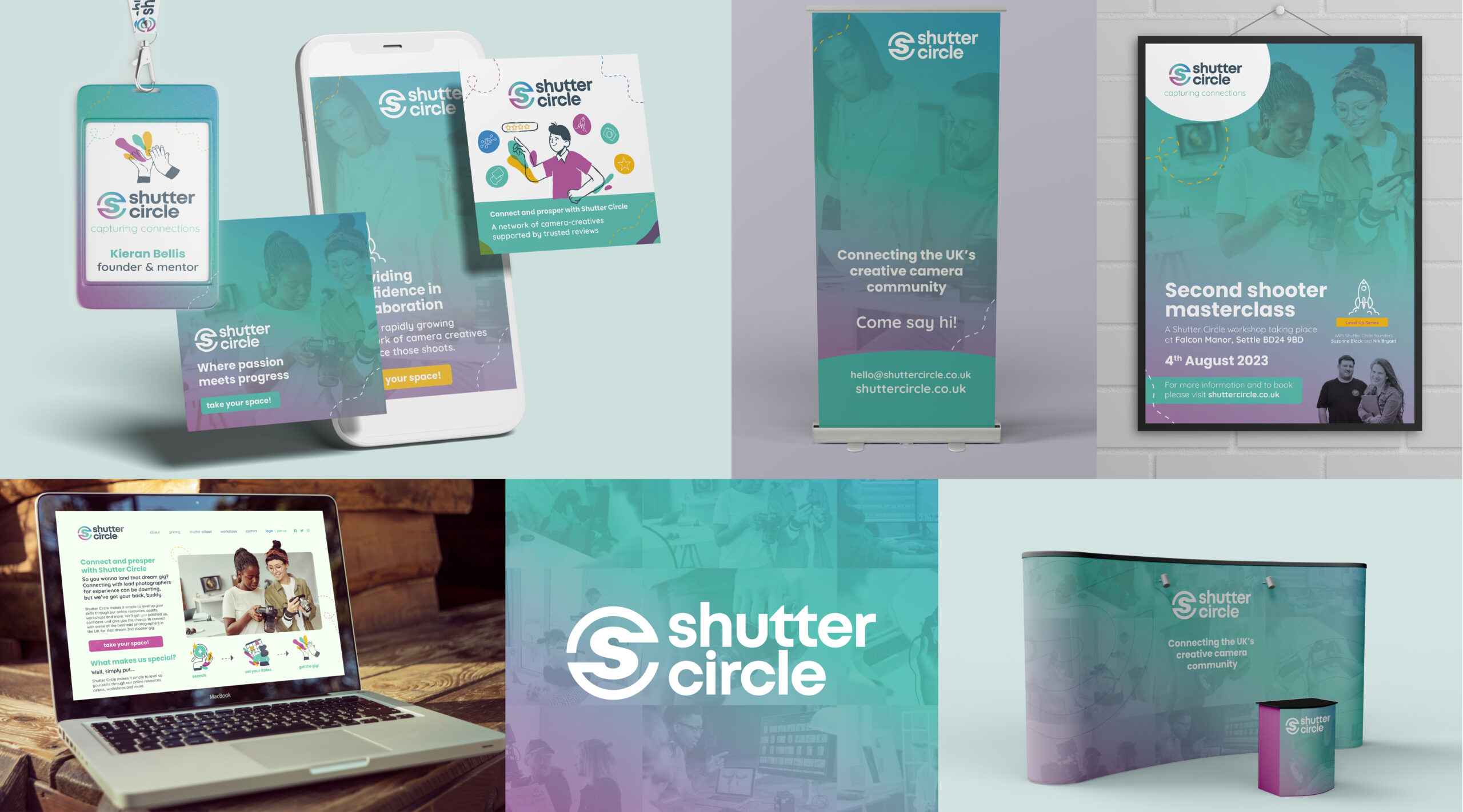
The final identity is modern, human and practical — built to reflect a growing creative community grounded in trust and support. Bold yet friendly visuals are anchored by a flexible logo system, a confident colour palette and typography with clarity at its core.
The tone of voice is plain-spoken and encouraging, equally at home welcoming newcomers or speaking to seasoned professionals. Supported by messaging frameworks, content examples and detailed brand guidelines, the team now has everything they need to grow with consistency — from social media to event branding.
Scope & Deliverables
Brand strategy & positioning
Competitor analysis
Project questionnaire
In-person discovery workshop
Archetype development
Tone of voice (with Dan Lever)
Messaging & slogans
Customer personas
Purpose, mission, vision, values
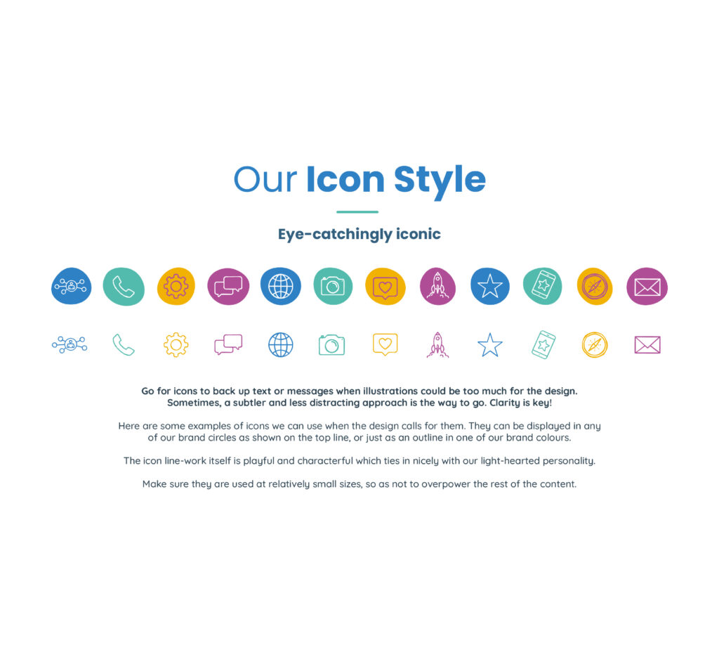
Logo suite & icon system
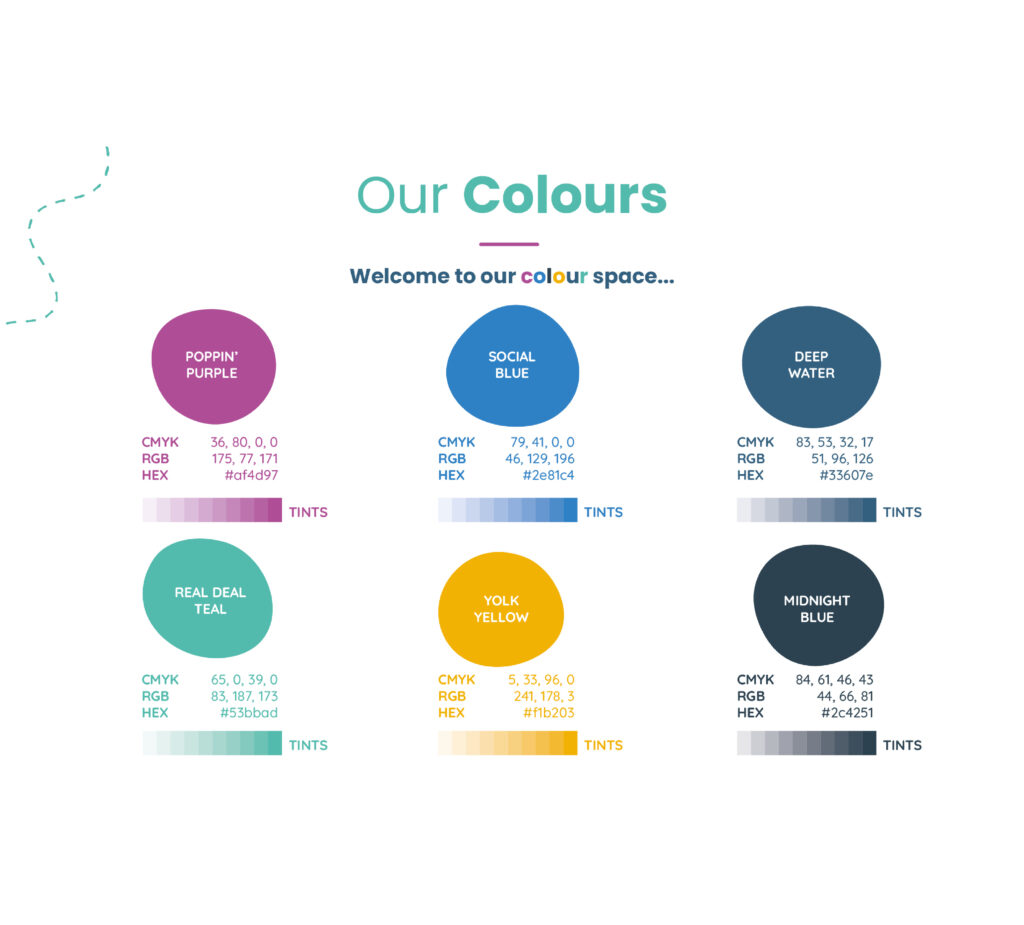
Colour palette & gradient
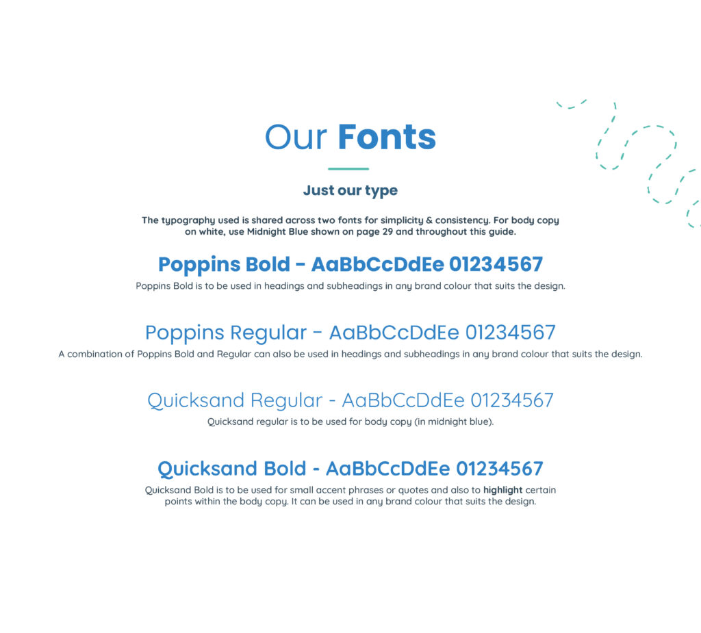
Typography system
Photography & overlay guidance
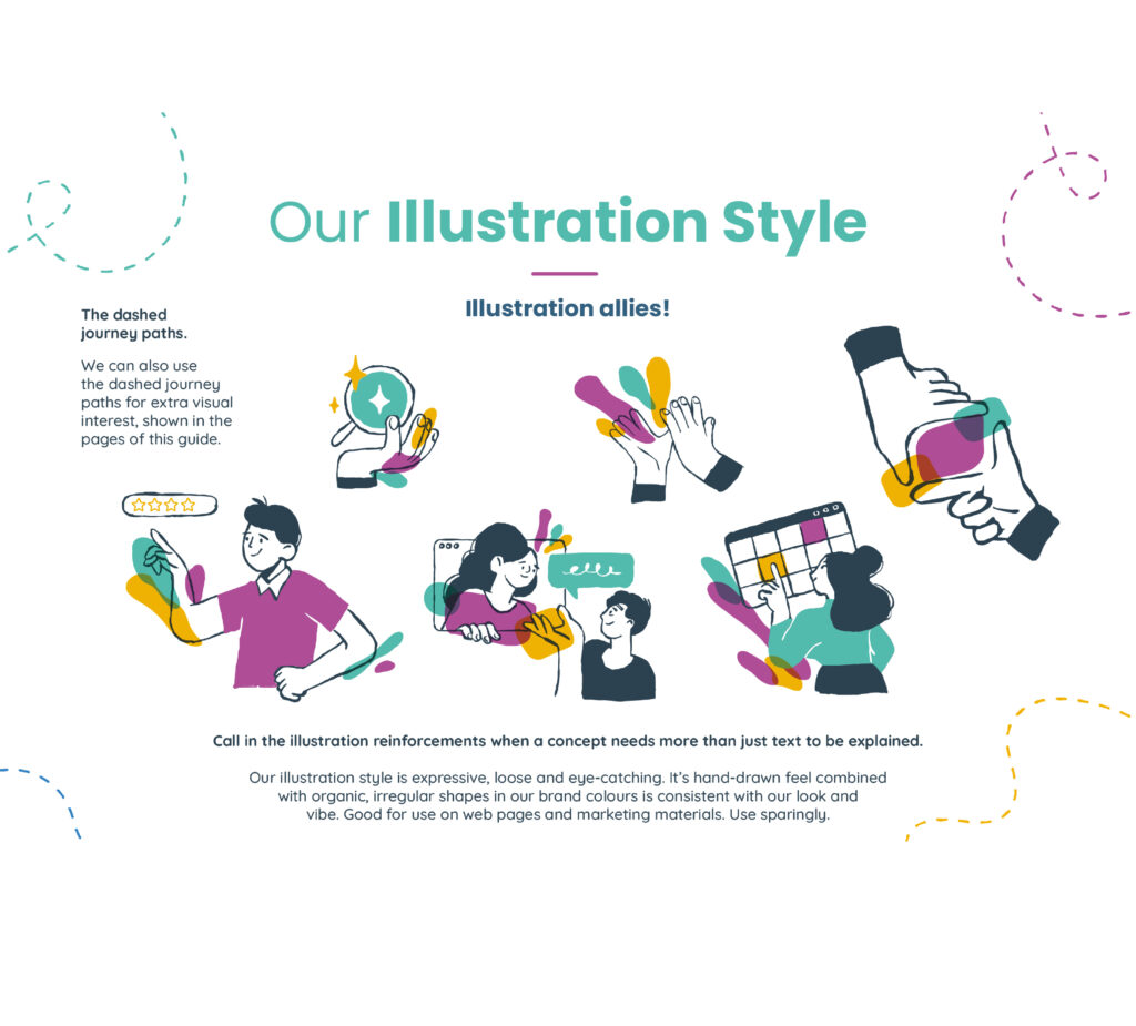
Illustration & icon style
Brand mockups (web, social, event)
Full brand guidelines PDF
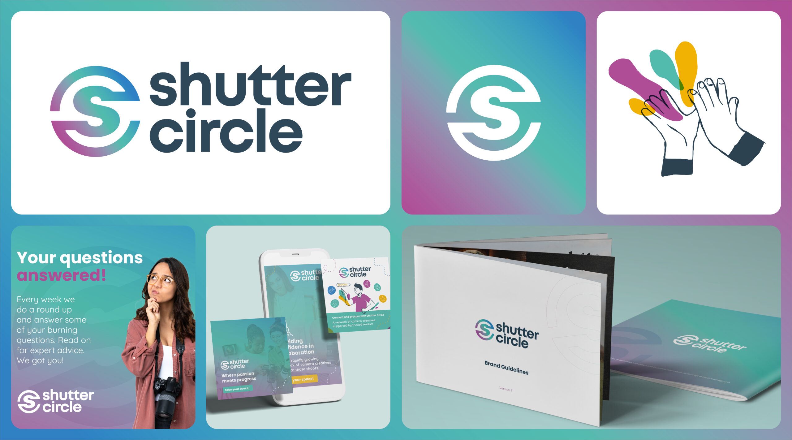
The logo design
The main logo is comprised of the ‘SC’ circle icon and the brand name. It is simple, bold and clean. Using inspiration from the humble lens cap, the copyright symbol and a connected line evoking a journey, the icon is right at home with Shutter Circle.
Brand Strategy
MISSION STATEMENT
Enabling UK camera-creatives to work together, level-up their skills and prosper in a supportive eco-system, centred on trust and actionable industry knowledge.
VISION STATEMENT
To become the UK camera community’s favourite place for creatives to professionally connect with each other, learn and grow.
VALUES
Community-mindedness -The community-mindedness value is all about creating a friendly, fun place to be. There will be a strong spirit of cooperation, trust, and mutual support among our members. This could be as simple as recommending someone for a job who is a better fit or answering a question in the facebook groups.
Friendliness -The friendliness value reminds us to always stay positive, warm and empathetic across all our spaces and communication. It’s our job to set the foundation for creating harmonious and uplifting spaces where people feel safe, have fun, thrive and form lasting bonds. From our website to our workshops and everything in between, we want to create experiences where the toxic nature of typical Facebook groups becomes a distant memory.
Supportive -The supportive value reminds us to stay true to our commitment of making a positive impact and helping our members to raise their game. This will be a common theme in our workshops, web events and blog articles where we share expert knowledge. Shutter Circle is as much about learning as it is about connecting people and this needs to be front of mind in what we say and more importantly, what we do.
Honesty -The value of honesty will guide us to always be transparent, sincere and show integrity in all we do. Trust is embedded in Shutter Circle, from the openness of our founders to those comforting, shiny stars on our members profiles that lead to confidence in collaboration. Building trust in our spaces should be ingrained in everything we do, and this starts with honesty and transparency.
As a team we sat down with Nige and talked over our ideas and goals and he really listened and came up with the whole concept, brand, colour schemes and produced a whole detailed brand guidelines… to remind us of the way to present ourselves across multiple platforms.
Paul Phipps-Williams Photography
★★★★★
It was not an easy brief, but Nige cracked it. I was presented with Brand Guidelines which have become my bible… ensuring a clean and consistent approach and giving me a strong bedrock for the future.
Gerry Mitchell
★★★★★
Founder & Director
Nige was with me, collaborating on the process from day one…I felt like he bought into my ideas, and really used his expertise to produce something of real value to me!
Odette Green Photography
★★★★★
Thank you so much I bloody love this!! I've had a good read through and love it all, nothing to change at all. It's all so me 🥰
Phillip Izzard
★★★★★
Founder & Director, Online Probate
I must say the final concept is stunning and has completely exceeded our expectations! The whole process was seamless and very professional…would highly recommend.
Julie Robinson
★★★★★
Founder, Time to Connect
Really professional, efficient, creative. Listened to what we wanted and delivered the branding exactly as we envisaged it.